Accessibility Post #1
// By Anna Heimbrock
Intro
Accessibility – Barrierefreiheit – toegankelijkheid, across the board more and more of our clients are pushing us to keep on looking at our work and to ask ourselves; how can we make it more accessible to a greater number of visitors?
In the Netherlands alone, it is estimated that around 2 million people live with some kind of disability. As public institutions, museums and science centres strive to be places that make everyone feel welcome and where everyone can discover, learn and have fun.
At YIPP, accessibility is a topic that has been on the rise for the past years. We do not claim to be experts. Rather, it is a new challenge we want to take on. Something we want to keep on learning and get better at together with clients and partners. We believe that it is important for museums to be places for everyone and we want our work to contribute to achieving this goal. Moreover, we strongly believe that by making our products more accessible, we make them easier and more enjoyable to use for everyone, not only for visitors with disabilities (think of a non-native speaker who can follow a video better with subtitles, or a visitor whose broken arm is temporary in a cast). With this blog post we want to share parts of this new journey with you.
WHAT DO WE MEAN WITH ACCESSIBILITY?
What do we mean when we talk about accessibility?
The World Health Organisation defines disability to take place across three dimensions:
Impairment in a person’s body structure or function, or mental functioning. Examples: loss of a limb or memory loss.
Activity limitation: Examples: difficulty to see, hear, walk or read.
Participation restrictions in normal daily activities. Examples: restricted participation in work, social activities or to obtain health care.
As a software company that creates digital site-specific interactive games in museums, our focus lies on several particular aspects of the work that we make. A lot has to do with how to make something digital accessible, however, our work also always contains physical parts such as sensors or touch screens as well.
Our goal is to make accessibility a key consideration throughout our entire work process. From concept phase, to screen design, to prototyping and testing up until the finished product. At this point we have a number of “focus points” for different aspects of our work. This is not to be taken as a static list to be ticked off. It is more a useful reminder for us, to take a look at every once in a while during a project, to check if we are not forgetting anything and to see where we might be missing an opportunity to create more access.
We want to share these focus points here to give you a glimpse at what we are working on behind the scenes and to hear if you have any valuable input for us on this topic. This is just the beginning of the journey. If you have any feedback or suggestions for us please send a message to Wouter Verbiest at wouter.verbiest@yipp.nl.

Often in a project we think “we could have…” but then it is already too late. For a recent project, we have subtitles in-VR, yet this is only so as to make the experience available in English (the audio is in Dutch). We could have identified from the start that there should also be Dutch subtitles, included the cost for this in the budget and added creating and implementing the translation to our planning. To consider accessibility from the very start and plan for it for the entirety of the project, best together with visitors with disabilities, is something we aim to do for each project.
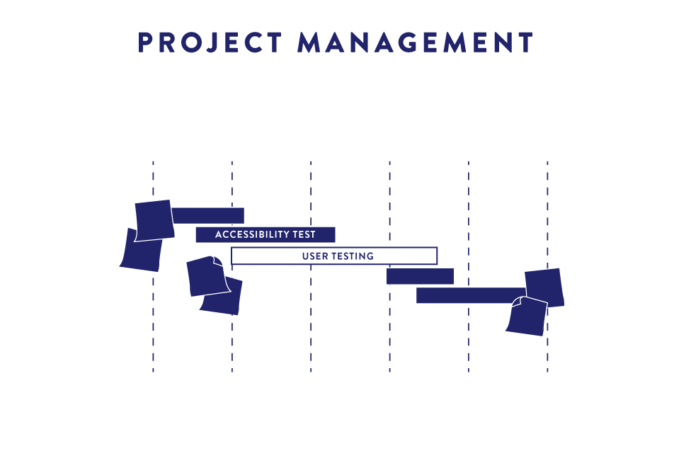
PROJECT MANAGEMENT
- Involve museum visitors with disabilities right from the start
- Take accessibility into consideration when it comes to project planning and budgeting. Will you need to do feasibility studies, R&D, user testing with specific target groups, produce sign language videos, etc.

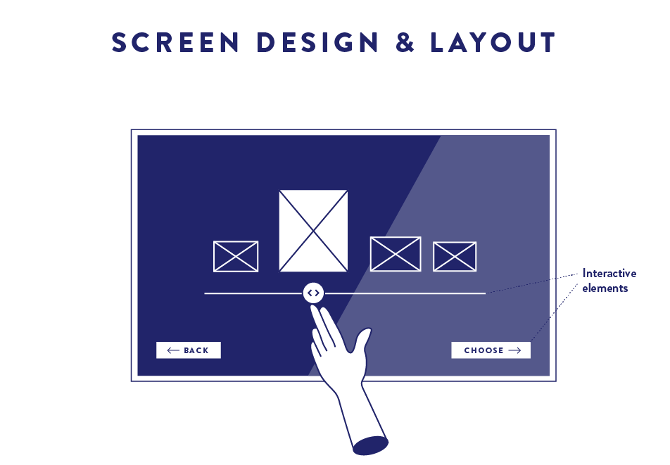
If a game contains a screen, then the layout and design should be intuitive and easy to use. Our games are often on touch screens, so interactive elements and navigation should be easy to find and use.
SCREEN DESIGN & LAYOUT
- Interactive elements, e.g. buttons, sliders, etc. should be easily understood to be interactive

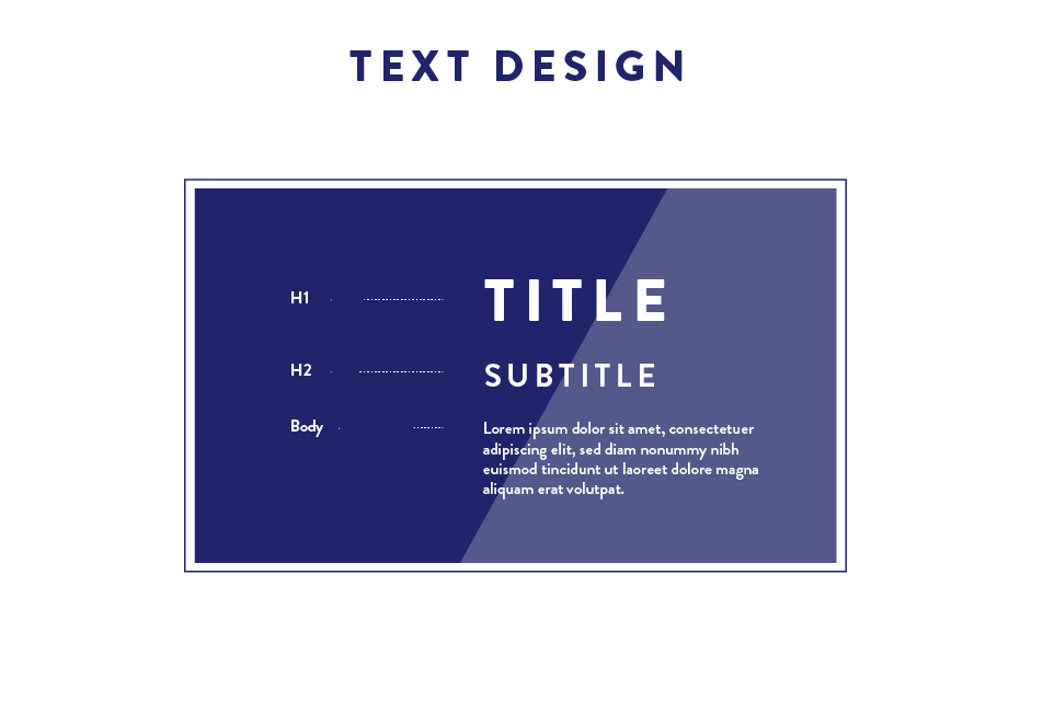
Text should be designed in such a way to make reading as easy as possible. For this, there are some widely acknowledged guidelines that we aim to follow.
TEXT DESIGN
- Less is more. Reduce the amount of text and break it into pieces.
- No cursive, if emphasis is needed use bold
- No all ALL CAPS in text, use it for titles and headers only
- No more than ca. 55 characters per line
- Best for reading is left justification with ragged right margin
- Where it fits, add images/illustrations to support the information of the text

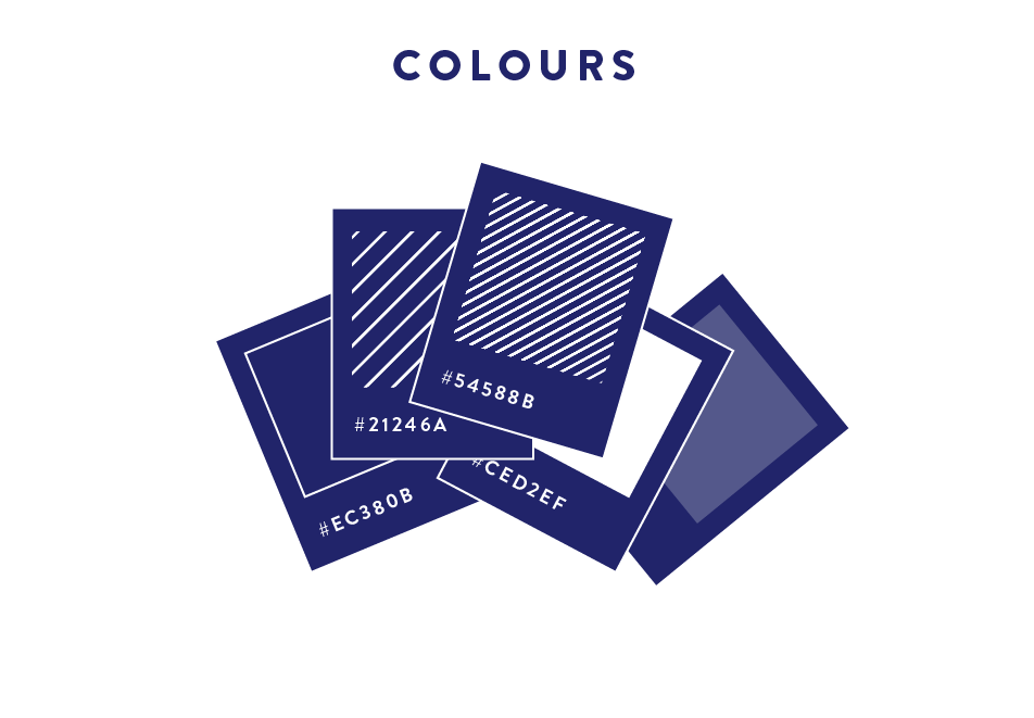
We love to make colourful designs and we often have text on non-white backgrouns. To ensure that all information can still be grasped and nothing is lost, we check if the contrast is good enough with special tools.
COLOURS
- text should have a high contrast to the background, this can be checked using a contrast analyser such as this one, or this simulator that displays your screen simulating different common color vision impairments.
- avoid certain colour combinations that are difficult to distinguish for many colour blind people. Think of the colours beforehand as shown here.
Further reading
We consulted these resources in our research:
- a great Dutch documentary that talks about disability on a meta level
- a book on how accessibility can be archived in different areas of museums
- inclusive design guidelines + activity cards
- info on how to take wheelchairs into consideration for spatial planning
- guidelines by the Deutscher Museums Bund on accessibility and inclusion
- the typographic scale and font sizes explained
- report on how to test software for accessibility
We found these useful tools in our research/recommended by clients:
- guidelines on best practice for subtitles
- color blindness simulator
- guide on accessible colour palettes
- online contrast checker
We are always on the lookout for new resources, tools and opportunities to learn. If you have any suggestions, or feedback, please tell us about it.
