Accessibility Post #2
// By Anna Heimbrock
Intro
Welcome back or welcome! This is part 2 where we look at our work through the lense of accessibility. You can find part 1 here.
To recap briefly,
Our goal is to make accessibility a key consideration throughout our entire work process. From concept phase, to screen design, to prototyping and testing up until the finished product. There are a number of particular aspects that we try to focus on especially which we have noted down here. This is not to be taken as a static list to be ticked off. It is more a useful reminder for us, to take a look at every once in a while during a project, to check if we are not forgetting anything and to see where we might be missing an opportunity to create more access.
We want to share these focus points here to give you a glimpse at what we are working on behind the scenes and to hear if you have any valuable input for us on this topic. This is just the beginning of the journey. If you have any feedback or suggestions for us please send a message to Wouter Verbiest at wouter.verbiest@yipp.nl.
In the previous blog post we looked at Accessibility and Project Management, Screen Design & Layout, Text Design and Colours. In this blog post we want to focus on aspects in which our work often differs from many other digital application (e.g. on the web).

Although we build software, we want to be involved in the spatial and construction aspects of a project as well. All of our games will be integrated in physical set-ups and if we know the details, we can adjust for certain things such as interactive areas to be within reach for wheelchair users and children.
SPACE & FURNITURE
- whenever possible, place screens at an eye level of ca. 1220 cm for wheelchair users and children
- consider the angle of the screen, e.g. horizontal screens may be difficult to see for wheelchair users and children
- think of the space underneath, if a screen is embedded in furniture, is there space for a wheelchair user to roll underneath the table
- whenever possible, place buttons and interactive elements within arm’s reach of ca. 1050 cm for wheelchair users and children
- When placing and adjusting the lights, try to avoid glare on screens and projections in bright rooms to increase visibility
- If a game is designed for a playtime of more than 5 minutes, flexible seating should be provided

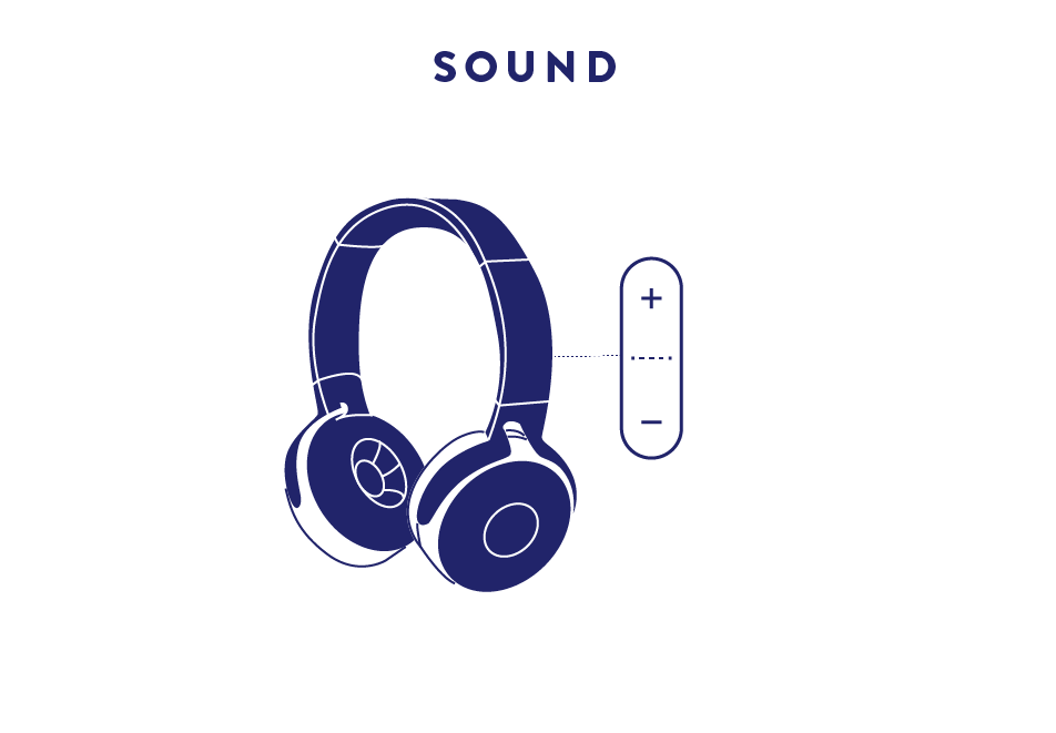
Having sound included in interactives and gallery spaces can be a great addition to the visitor experiences. Sound design and sound effects can make gameplay more fun and more easy to use by adding an an additional layer of feedback to players.
However, one should think carefully about sound when it is played inside the general gallery space. Certain sounds can be distracting, or overwhelming for visitors. Another important group to consider are on floor staff members who may have to listen to the sound scape all day (so don't play jingle bells on repeat ;)).
This can be solved by delivering some sounds via headphones .In this case, visitors should be able to adjust the volume and open captions should be provided.
SOUND
- When there is narrative audio, open captions should be provided. Take a look here for best practice guidelines on open captions.
- Ideally, when there is narrative audio visitors can adjust the sound volume.
- if sounds are continuously playing in the gallery space, make sure to avoid having sounds that can be annoying (e.g. spoken words played on a loop, loud sound effects) or overwhelming

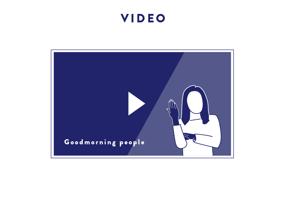
Similar to narrative audio, for videos too, open captions should be provided. Where possible, they should form a whole with the rest of the design.
VIDEOS
- When there is narrative audio, open captions shall be provided.
- Consider adding sign language to your videos to create even more access. Remember, there is no universal sign language, each country has their own language.
- Do not place looping videos right next to info texts. If info texts are displayed, all videos should stop playing.

We love to work with different types sensors and input. Curious what kinds? We talk about some more unusual sensors in the blog post we wrote on corona proofing museum exhibits.
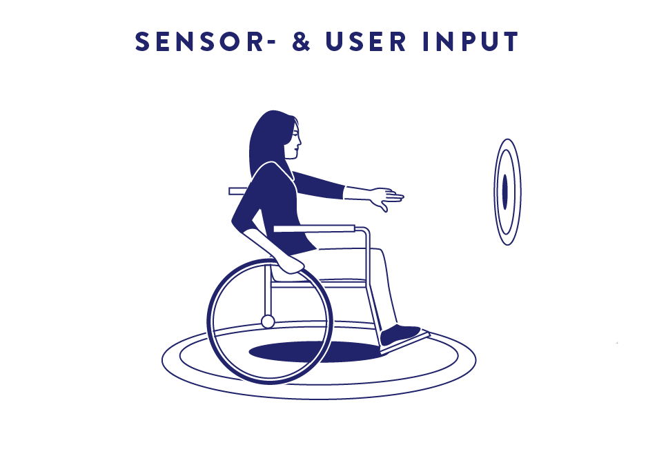
It is good to consider the implications of using different kinds of input. Not every exhibit will be accessible for every type of visitor. Wherever possible try to optimise, so the largest group of visitors could use an exhibit. e.g. through some R&D work we managed to ensure that our immersive project spaces can detect visitors who are using a wheelchair.
SENSOR- AND USER INPUT
- R&D and test to see if you can tweak software and or device in such a away to increase accessibility
- if you have input devices to be used with one hand, consider whether right-, as well as left handed visitors could easily use this

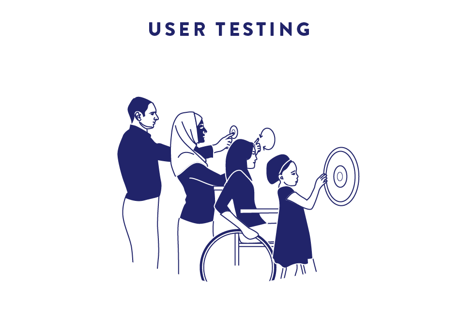
User testing is crucial to ensure that the design considerations that have carefully been made actually "hit-home" so to speak. A great starting point is to ask the client to provide a small group of members of their primary target audience and have this group test some prototypes.
USER TESTING
- Testing with different types of users (age, ability)
- Testing at different stages in the process (concept, prototype, inside the museum & at YIPP)
- How to include the client, have them provide who they think their primary target audience is
Further reading
We consulted these resources in our research:
- a great Dutch documentary that talks about disability on a meta level
- a book on how accessibility can be archived in different areas of museums
- inclusive design guidelines + activity cards
- info on how to take wheelchairs into consideration for spatial planning
- guidelines by the Deutscher Museums Bund on accessibility and inclusion
- the typographic scale and font sizes explained
- report on how to test software for accessibility
- Guidelines on how to write museum texts
We found these useful tools in our research/recommended by clients:
- guidelines on best practice for subtitles
- color blindness simulator
- guide on accessible colour palettes
- online contrast checker
We are always on the lookout for new resources, tools and opportunities to learn. If you have any suggestions, or feedback, please tell us about it.
