The 'Minority Report reference'
Anyone working in our field will have heard this during a client briefing some time or another: "we want it to be something cool and futuristic like in that movie "Minority Report"... you know!" Now, it's is pretty impressive that a movie made back in 2002(!) still gets labeled 'Futuristic' in 2017, without irony. So it got me wondering about two things:
1. What makes this movie still seem credible 15 years after it's release? Most Sci-Fi movies get dated pretty fast. Back To The Future's version of 2015 sure seemed quite silly when 2015 actually came around. So the people working on Minority Report must have been doing something right.
2. Why aren't we seeing any gesture based interfaces, like the one in the movie's iconic opening scene, in our daily lives?
Why is it so good?
When Spielberg started to work on the movie, he got together a bunch of leading scientists, futurists and designers and locked them in a room for a weekend, together with the film crew. They wrote down the results of that brainstorm and made a vision of the future called the "2054 Bible". This Bible was used as a reference throughout the production process and shaped the world you see in the movie.
The intention was to construct a world that would seem like a feasible future. Proof that this approach worked out really well is in the fact that a lot of things you see in the movie are already visible in their early development today: electric autonomous vehicles whizzing by on the highways, customized personal ads when walking by billboards, Virtual Reality, Jet-packs (okay, nobody is really making a hard push on Jet-Packs, but wouldn't it be awesome!) Also the voice activated home automation system is done nicely and with all the big Tech players betting heavily on AI, it's probably coming sooner than you think.
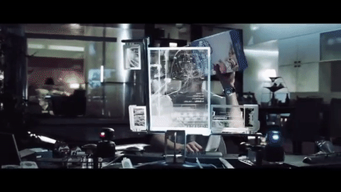
Cereal box video
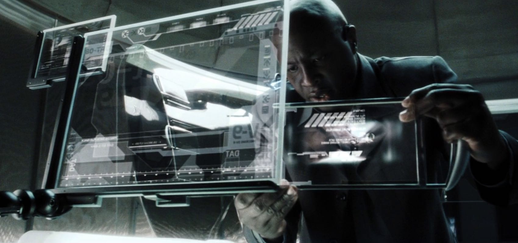
Physical data carrier
So... where are the gesture interfaces?
Yeah, were are they?! In terms of motion tracking devices we have had the Microsoft Kinect (which is probably going to be phased out (http://techaeris.com/2016/06/15/end-xbox-one-kinect-sensor/ ) due to lack of success) and the lesser known Leap Motion. But no interface that really made it to the mainstream.
I think the reason is: it's not significantly faster than what we are doing now. In fact, it's probably slower! There is no reason to switch from the keyboard, mouse and touch interfaces we use to control our laptops, PC's and mobile phones, to a system that has us waving our arms around like crazy just to simply select and scrub through a movie file.

Looks cool though
I have tried controlling my computer using the Leap motion and although of course all user interfaces are built to work with our regular input devices and not with gestures, still the experience of gesturing into thin air with no physical feedback and my arm cramping up in about 10 minutes was so horrible that it put a big dent in my belief in gesture interfaces.
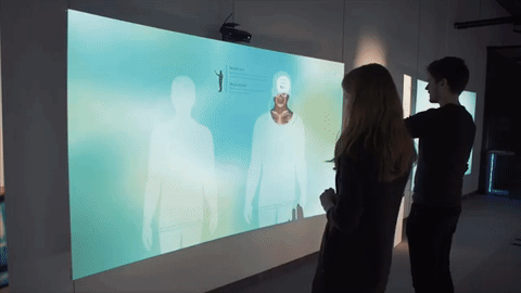
In the museum!
That's not to say that there isn't any use for gestures. Actually we use gesture based interfaces all the time in our projects. But when we do, the interactives are specifically designed for it. As a designer of interactive experiences, we always take the user as the main focus. Influencing the context and the willingness to learn is very important when it comes to designing compelling experiences.
The context sets the mindset when entering that experience. Visual and conceptual cues are influential to that mindset and set the expectations a user might have regarding the experience. Making proper use of connotations, idioms and clichés are key for grabbing the users attention and engagement in the experience.
This engagement also has to do with the willingness to learn. You're asking the user to put some effort into the experience (the interaction), thus you need to reward her for that effort. When a user is not used to interact in this manner, the challenge to do so has to be feasible one and her progress should be rewarded. This gives the user the idea that she is getting the hang of it, otherwise you might lose the user.
As such, it is the designer responsibilities to make the experience low threshold, and with every small piece of interaction, the user needs to be rewarded in order to further her engagement into the experience. You try to build up the users self-efficacy in regards to the controlling of the interactive.
So the basic rule to make it work is: keep it simple! Low threshold, clear direct feedback, simple interactions, and gradual learning curves.
Gesture interaction